I'm setting up shop!
Blah Blah Blah Blog
Tuesday, June 25, 2013
Tuesday, May 3, 2011
Studio Space
My studio space starts clean. Clean floor, clean tools, clean surfaces. Then I start whatever art task I choose to do and the floor, tools, and surfaces quickly become very messy. Things will usually stay quite messy until shortly after I have finished whatever it was I started and gone outside taken a breath, then I will clean the space and start over. My last finished piece will usually be: hidden out of sight for a few days(if the experience of making it was too traumatic), or neatly sitting on a table next to my work surface ready to supervise the making of the next.
Michelangelo v. Chihuly
Photo by Margo Belisle
 David, 1501-1504, Michelangelo
Photo by Raymond Longaray
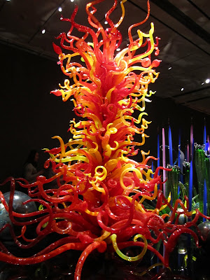 Mille Fiori, 2011, Dale Chihuly
Photo by Margo Belisle
 David, 1501-1504, Michelangelo
Photo by Raymond Longaray
 Mille Fiori, 2011, Dale Chihuly
Photo by Margo Belisle
Sunday, May 1, 2011
Bachelor of Fine Arts Senior Thesis Presentations
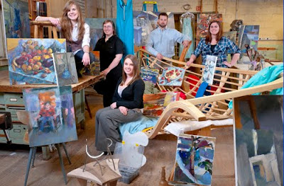
It's one experience to view an art exhibit and formulate your own ideas about the pieces and a completely different experience to hear the artist discuss their ideas and processes behind their work. Josh Torbick, Katharine Austin, and Shayna Bicknell's presentations discussing their work.
I had the experience of watching some of Josh's work progress and transform over the year through glimpses in the wood shop and conversations in the foundry. One noticeable change in his work was his integration of metal into his wood furniture sculptures. His first project, a bench, had subtle embodiments of visible screws throughout the piece. The next, a large hammock reclining bench form for laying in, was mostly wood, but the steel structure became more pronounced and was a more significant part of the piece. In Josh's last piece, the metal was almost as equally important in the piece as the wood was. The steel parts were finished to a shine and clear coated, giving the metal an almost superior character over the wood. Another theme that repeatedly came up in Josh's dialogue were references to how the piece expressed memories from his childhood. From camping to vegetable farming, in Josh's work the idea of the tool and machine being a functional device to a person expand into becoming works of furniture.
I enjoyed Katie's approach to painting and the results she accomplished. She used a palette knife in all of her paintings giving the lines a fuzzy blended appearance, which I love to see(and I personally love to use the palette knife). Katie talked about focusing mostly on interior spaces and the relationship they had not only to herself but the other BFA students, probably because these are the spaces where they spent most of their time! She also studied color, light, and perspective comparisons. She bent lines to obscure the perspective and played with contrasting artificial and natural light sources.
My first observation of Shayna's work was during the exhibition's opening night. I definitely felt more drawn to her smaller works which were so intricate and full of bold colorful shapes crammed on a small canvas, the paintings jumped out at me and shouted HELLO I AM HERE, LOOK AT ME. She discussed her choice of painting mostly landscapes and how she intended for the authority of her color swatches to demand the same presence through out her paintings, which is a bold move I liked in her work because it forced the painting to be seen and distinguished, not just an image to be casually walked by.
Monday, April 4, 2011
Visiting Artist Lecture Vivian Beer
Leah Woods had posted fliers around the Service Building for 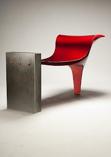 visiting artist Vivian Beer, and stopped by the ceramics room during class to encourage students to attend. I was thrilled to attend because there haven't been very many(if any) sculpture artist lectures and I thought she had an awesome name!
I believed Vivian Beer's artist lecture was executed very well and certainly left me with a feeling inspiration. She first talked about her life growing up on the rural coast of Maine pretty much living without electricity or running water, spending most of her time out and about the wilderness. Beer flipped through many pictures she had taken from the outdoors that inspired her, kind of like her little collection box of favorite images that she keeps for motivational ideas for her work-- clouds, trees, landscapes. Beer uses the images around her to abstract her ideas from, so with the overflow of images thrown at us today through television, magazines, newspapers, and billboards, Vivian's image collection has grown to include new trendy shapes.
Many of Vivian Beer's works tiptoe the line between functional and non functional. Some pieces of furniture are elevated to tower above the viewer, giving a new perspective to what a chair is and possibly how it is and isn't used. She enjoys the idea of the chair the most, because a chair is most personable-- it has arms, legs and a back; can be in the kitchen or the dining room, or on the front porch; the chair can be anywhere.
Most of Beer's work is designed with sheet metal, her preferred medium which she pounds and shapes into forms that sometimes strikingly resemble a sleek new Ferrari. She wanted the people who sit on her benches to feel a sense of excitement that they would if they were sitting in one of those expensive suave cars.
She began experimenting with auto body paint finishes and soon her furniture and sculpture took on a whole new dazzle. She described the candy red paint she would layer on top of a hot pink paint coat making the red a vibrant hue of sparkle and color.

Another interesting aspect I found about her presentation, were the photographs taken of her sculptures. The blur of a person in the background walking by, examining, and/or sitting in the bench or chair gave the furniture a more approachable dimension. These weren't photos documenting cold quiet metal sculptures, the people in the pictures made them seem more interactive, functional, and playful which seems to be more of her intended purpose for those pieces.
 visiting artist Vivian Beer, and stopped by the ceramics room during class to encourage students to attend. I was thrilled to attend because there haven't been very many(if any) sculpture artist lectures and I thought she had an awesome name!
I believed Vivian Beer's artist lecture was executed very well and certainly left me with a feeling inspiration. She first talked about her life growing up on the rural coast of Maine pretty much living without electricity or running water, spending most of her time out and about the wilderness. Beer flipped through many pictures she had taken from the outdoors that inspired her, kind of like her little collection box of favorite images that she keeps for motivational ideas for her work-- clouds, trees, landscapes. Beer uses the images around her to abstract her ideas from, so with the overflow of images thrown at us today through television, magazines, newspapers, and billboards, Vivian's image collection has grown to include new trendy shapes.
Many of Vivian Beer's works tiptoe the line between functional
 and non functional. Some pieces of furniture are elevated to tower above the viewer, giving a new perspective to what a chair is and possibly how it is and isn't used. She enjoys the idea of the chair the most, because a chair is most personable-- it has arms, legs and a back; can be in the kitchen or the dining room, or on the front porch; the chair can be anywhere.
Most of Beer's work is designed with sheet metal, her preferred medium which she pounds and shapes into forms that sometimes strikingly resemble a sleek new Ferrari. She wanted the people who sit on her benches to feel a sense of excitement that they would if they were sitting in one of those expensive suave cars.
She began experimenting with auto body paint finishes and soon her furniture and sculpture took on a whole new dazzle. She described the candy red paint she would layer on top of a hot pink paint coat making the red a vibrant hue of sparkle and color.

Another interesting aspect I found about her presentation, were the photographs taken of her sculptures. The blur of a person in the background walking by, examining, and/or sitting in the bench or chair gave the furniture a more approachable dimension. These weren't photos documenting cold quiet metal sculptures, the people in the pictures made them seem more interactive, functional, and playful which seems to be more of her intended purpose for those pieces.
Visiting Artist Workshop Karen Orsillo
So It's maybe 5pm and my intro to ceramics class if coming to an end, I finish glazing one of my latest slab projects and start cleaning up when I hear my professor, Don, announce that there will be a visiting artist doing a talk and demonstration about colored white clay. I normally go directly to the gym after class but I decided to stay and listen in with a few of the ceramic workshop students who showed up for the lecture.
Karen Orsillo was our speaker and demonstrator on coloring porcelain clay. She laid out some of her pieces of work and I was very intrigued by the array of eye-catching colors. She had been working with colored clay for over 30 years! She got her BFA in ceramics and started working with colored clay as an undergrad at UMass Amherst.

Because time was limited to an hour, Karen spoke mostly about the techniques used to make colored clay patterns by layering different colors, cutting pieces off, and rearranging them for specific designs. Her techniques were very clean and precise, she obviously knew what the business was all about.
Karen Orsillo was our speaker and demonstrator on coloring porcelain clay. She laid out some of her pieces of work and I was very intrigued by the array of eye-catching colors. She had been working with colored clay for over 30 years! She got her BFA in ceramics and started working with colored clay as an undergrad at UMass Amherst.

Because time was limited to an hour, Karen spoke mostly about the techniques used to make colored clay patterns by layering different colors, cutting pieces off, and rearranging them for specific designs. Her techniques were very clean and precise, she obviously knew what the business was all about.
Tuesday, March 22, 2011
Taken by the Wind
Wind Sculptures by Lyman Whitaker
This year's spring break was pretty uneventful. I stayed on campus and visited my boyfriend, Andy, in Maine for a few days to escape the ghost town UNH has become. I was talking with Andy's dad about some of my latest work in metal fabrication and he suggested visiting one of the art stores not too far away to see some interesting metal sculptures.
So we drove to the Maine Art store in Kennebunk and as soon as we turned onto the street I knew what cool sculptures Andy's dad was talking about.
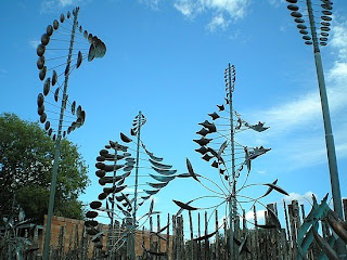
These giant, swirling, undulating, double helix forms twisted in the wind. We walked around the small front lawn poking and taking pictures of the sculptures. Lyman Whitaker works out of Utah, but his sculptures are displayed all over the US such as Appleton, WI; Whittier, CA; St. Louis, MO; and Denver, CO.
Subscribe to:
Comments (Atom)

